5 Bootstrap Layout Tips for UI Challenged Developers
Normally user interface designs come from layout artists, but there are times that the developer and the layout artist are one and the same. However, not every developer is gifted with an eye for design, so this task is a bit of a challenge. Here are some tips and tricks to consider when you wish to create pages that are easy on the eyes:
1- Determine the purpose of the website
First of all, you need to think of what the website is all about and what it is for. Use simple color combinations, preferably including white for the main body of information-heavy web pages such as online encyclopedias, wikis, school websites, and online libraries. Who is the target audience/users of the site? If, for example, the audience is mostly students, you can provide them with an advanced search column. Organize the buttons and links in a way that is easily accessible and understandable without diverting attention from the main content of the page by placing advertisements or flash animations a considerable distance from them.
2- Try a simple 3-Column navigation layout
For pages that contain a lot of modules and information categories, you might want a layout that has a simple banner at the top, a navigation bar for the different modules of the website. After this, your page body can have 3 columns:
- Links to specific module detail pages
- Main body
- Extra links column, with a search bar (to related modules or external pages)

In bootstrap, all you need is to utilize the framework’s grid system. Choose light colour combinations as the visitors of pages like this are there for information rather than entertainment.
To create the sidebars you can follow this code:
<div class="sidebar left">
  <div class="sidebar-nav-fixed">
    <p>Left Sidebar Content</p>
  </div>
</div>
<div class="sidebar right">
  <div class="sidebar-nav-fixed">
    <p>Right Sidebar Content</p>
  </div> </div>
3- Square Grid Layouts
This can be used mostly on business type websites because they usually have lots of content that they want to show right on the home page. The grids contain snippets and thumbnails of content that can be found on the other pages. You can have a slightly larger banner for this one with images of your establishment or promotions.
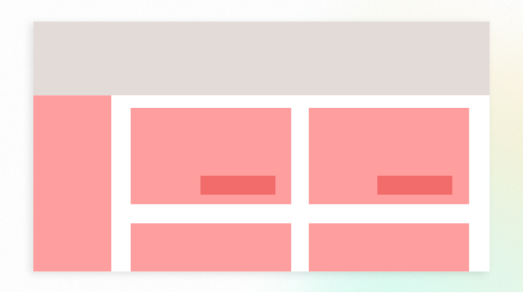
To achieve this you can also simply make use of the bootstraps grid and column system. Here’s a code snippet to create columns within a grid container:
<div class="container">
  <div class="row">
    <div class ="span4">
     /* Content */
    </div>
  </div>
</div>
When we say business type websites, we are referring to company pages or corporate websites. Sites that are for online shopping are more suited to the 3-column navigation style.
4- Use images with appropriate sizes
Consider the images and animations that you’ll be using. Make sure that the sizes of the images you’ll be using match the size of the containers where you’ll be putting them in. This is to avoid stretched or pixilated images. Also, avoid showing pictures that are too large right away because these are primary causes of slow loading time. If there is a need to show them in their full glory, you can just have thumbnails and link them to the full-sized pictures
5- Use appropriate font families and color combinations
Limit the fonts that you use to ones that are easy to read no matter what the screen size is, like a Serif for headers and Sans Serif for the body. Also, make sure that you use only one or two varieties per page because this also contributes to loading time. Here’s a CSS snippet for setting fonts:
@font-face{
  font-family: 'MS Sans Serif';
  font-style: normal;
  font-weight: 300;
src:url(file://link-to-ms-sans-serif-font) format('woff');
}
Designing your website doesn’t need to be a gruesome task. As long as you are able to present your data in a neat and efficient way, your visitors will be pleased. Looking forward to hire software development company for your website designing & development requirement? Contact our experts.
